25 Call to Action Examples You Might Not Have Considered
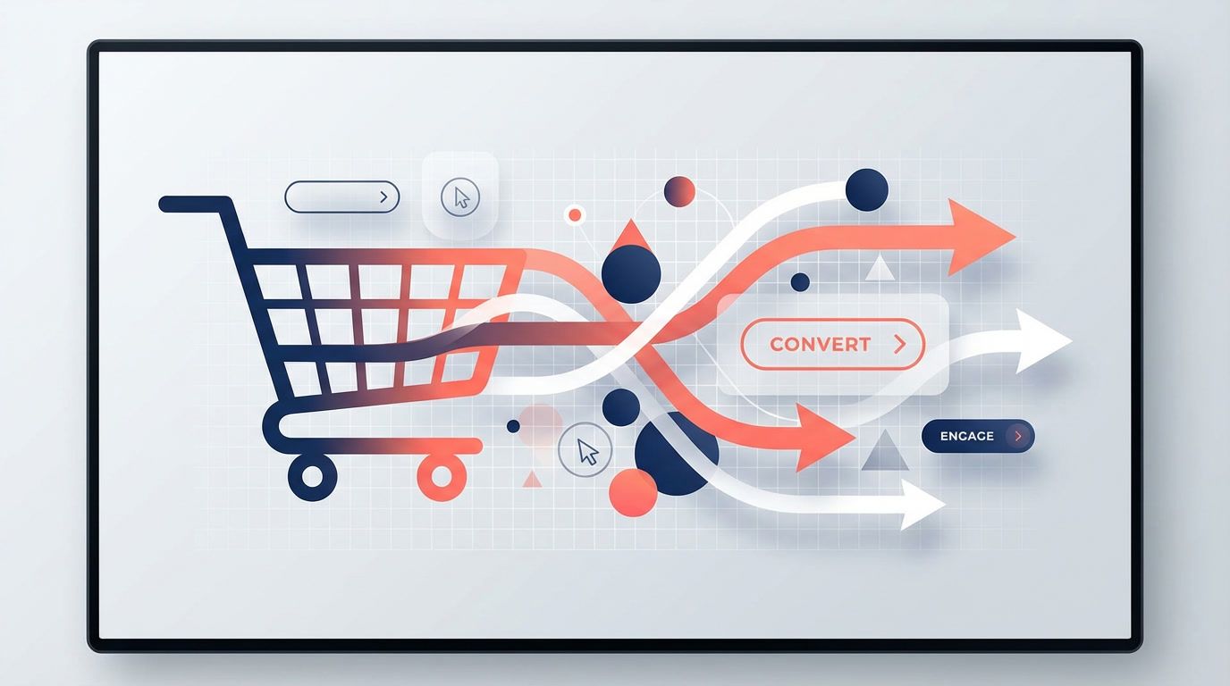
Popup-specific CTA framework with test results on button copy, color, placement, and urgency elements.
Michael Torres
Semrush Certified · Ahrefs Power User · 500+ articles published
25 Call to Action Examples You Might Not Have Considered
Cart abandonment isn’t just an email problem. For many stores, the decision to buy (or bounce) happens right on the site. That’s where popup CTAs can do heavy lifting — if you treat them as testable mini-campaigns, not afterthoughts. Below is a popup-specific CTA framework with results-oriented examples you can run as A/B tests on button copy, color, placement, and urgency elements. You’ll also find a few benchmarks and best practices drawn from high‑trust sources.
If you’re already using popups, this is about getting more precision and fewer guesses. If you aren’t, start with the psychology behind why CTAs work. Research from Shopify’s abandoned cart guide and HubSpot’s abandoned cart examples consistently points to action‑oriented, benefit‑specific buttons as the clearest path to conversion.
The Popup CTA Framework (Built for Testing)
Here’s a simple structure that makes popup CTAs easier to test and optimize:
- Promise — The benefit or outcome (save, ship faster, unlock).
- Action verb — The behavior you want (claim, finish, unlock).
- Urgency or friction reducer — Time cues, risk reversal, or clarity.
For example:
- “Claim 10% Off Now” (promise + action + time)
- “Finish Checkout — It’s Saved” (action + friction reducer)
As a reminder, the CTA is the most visible commitment point. Klaviyo’s abandoned cart best practices emphasize that CTA clarity and prominence are often the highest‑impact lever for recovery campaigns.
What We Mean by “Statistical Significance” (Without the Jargon)
To keep this practical: you should test each CTA in controlled splits and wait for enough data that the difference is unlikely to be random. Tools like Revenue Boost include A/B testing inside popup workflows, so you can set a baseline CTA and compare against a variant. If you’re not using A/B testing, you’re not learning — you’re guessing.
Quick rules of thumb
- Keep traffic split 50/50.
- Run long enough to stabilize (often 1–2 weeks).
- Change only one variable per test: copy or color or placement.
25 Popup CTA Examples You Might Not Have Considered
Each example includes where it works best and what element you’re likely testing.
1) “Finish My Order”
Best for: Cart abandonment popups
Test: Button copy vs. “Complete Checkout”
The possessive tone (“my”) creates ownership. Similar action phrasing is recommended by Shopify.
2) “Return to My Cart”
Best for: Exit-intent cart popups
Test: Copy with “my” vs. generic
This mirrors effective email CTA phrasing cited in Shopify’s examples.
3) “Unlock 10% — Today Only”
Best for: Flash sale popups
Test: Urgency tag on button
Adds time constraint without crowding the headline.
4) “Keep My Items Reserved”
Best for: Cart abandonment
Test: Fear of loss angle
Works especially well when stock is limited.
5) “Yes, Save My Cart”
Best for: Exit-intent
Test: First-person CTA vs. neutral
Often boosts clicks because the action sounds like self‑interest.
6) “Get Free Shipping Now”
Best for: Threshold popups
Test: Benefit-first vs. discount
Shoppers frequently value shipping incentives more than small discounts.
7) “Apply 15% Instantly”
Best for: Coupon reveal popups
Test: Immediate gratification language
Reinforces zero delay and reduces friction.
8) “Continue Checkout”
Best for: Cart abandonment
Test: Minimalist, low‑pressure action
Simple CTAs can outperform “hard sell” language depending on brand tone.
9) “Secure My Order”
Best for: High-AOV carts
Test: Trust-oriented framing
This can be strong for jewelry, electronics, or subscription boxes.
10) “Hold My Price”
Best for: Limited-time pricing
Test: Urgency plus loss aversion
Avoids shouting “Hurry!” but still signals scarcity.
11) “Send My 10% Code”
Best for: Email capture popups
Test: Specific action vs. generic “Submit”
For more email list ideas, see email popup strategies.
12) “Reveal My Deal”
Best for: Spin-to-win popups
Test: Curiosity framing
Encourages the click even before a direct purchase.
13) “Keep Shopping — Save for Later”
Best for: Exit-intent
Test: Secondary CTA placement
This option can reduce bounce while preserving the sale path.
14) “Claim VIP Access”
Best for: Newsletter popups
Test: Exclusivity angle
Pairs well with early access or product drops.
15) “Get Early Access”
Best for: Product launch
Test: Urgency without discounting
Ideal if you want to protect margins.
16) “Yes, I Want the Upgrade”
Best for: Upsell popups
Test: Positive framing
Matches common persuasive CTA patterns in Unbounce’s CTA analysis.
17) “Save 10% and Checkout”
Best for: Cart abandonment
Test: Benefit + action combo
Clear dual benefit can lift click‑through.
18) “Try It Risk‑Free”
Best for: Subscription trials
Test: Risk reversal on button
Often boosts response when paired with guarantees.
19) “Send My Cart”
Best for: SMS or email cart recovery
Test: Alternative action for hesitant buyers
Gives shoppers a way out without losing them.
20) “Unlock Bundle Pricing”
Best for: Bundle offers
Test: Perceived savings framing
Works great with multi‑item carts.
21) “Yes, Add the Free Gift”
Best for: GWP campaigns
Test: Incentive-based copy
Gift language is often more motivating than a straight discount.
22) “Return to Checkout”
Best for: Cart abandonment
Test: Copy simplicity
Often a stable control CTA.
23) “I’ll Take Free Shipping”
Best for: Shipping threshold popups
Test: First-person + incentive
A tested angle from VWO’s CTA framework.
24) “Reserve My Items — 15 Min”
Best for: Exit-intent
Test: Time-bound language
Pairs urgency with a tangible window.
25) “Finish in One Tap”
Best for: Mobile popups
Test: Speed/effort reduction copy
Highlighting low friction can reduce cart abandonment.
CTA Elements You Should Test (And How)
Copy
Action verbs are the obvious test. But add a benefit or removal of risk. HubSpot’s examples show that specificity beats generic CTAs in almost every case.
Color
Test a color that contrasts with your popup background. High‑contrast buttons typically outperform brand‑matching tones. Avoid testing more than one variable in the same run.
Placement
Most popups place the CTA on the right or centered. But a left‑aligned CTA can be stronger for “read-first” audiences. For popup platform comparisons, see the best Shopify popup apps.
Urgency
Add urgency to the button text, not just the headline. A short time cue on the CTA itself can lift clicks by signaling that action is the goal.
Secondary CTA
Sometimes the best conversion boost comes from adding a “save for later” or “send my cart” option. That can reduce the pressure while keeping the shopper connected.
How to Structure a Popup A/B Test Program
- Start with cart abandonment — it’s the most direct revenue recovery use case.
- Pick one variable — button copy is usually the fastest win.
- Collect enough data — aim for statistical confidence before declaring a winner.
- Roll the winner to similar popups — reuse patterns across exit‑intent and flash sales.
- Iterate — what works in Q4 may change in Q1.
If you’re testing across multiple popup types, you might want a platform built for it. Revenue Boost lets you run smart popups (newsletter, spin‑to‑win, flash sales, exit‑intent) with built‑in A/B testing and GDPR compliance. If you’re comparing apps, here’s a focused cart abandonment popup roundup and a Klaviyo‑oriented comparison.
Popup CTA Templates for Different Use Cases
Cart Abandonment
- Finish My Order
- Return to My Cart
- Keep My Items Reserved
- Save 10% and Checkout
Email Capture
- Send My 10% Code
- Reveal My Deal
- Get Early Access
- Claim VIP Access
Flash Sale
- Unlock 10% — Today Only
- Hold My Price
- Reserve My Items — 15 Min
- Get Free Shipping Now
FAQ
What’s the best CTA for cart abandonment popups?
There isn’t a universal winner. “Finish My Order” and “Return to My Cart” are strong baselines, but the best CTA depends on your audience and incentive. Test first‑person and action‑oriented variants to find your winner.
How many CTA tests should I run at once?
One per popup. If you change copy and color at the same time, you won’t know which factor caused the improvement.
Do urgency CTAs hurt conversion?
They can if they feel fake. Urgency should match the offer. Real‑time limits (inventory or pricing) perform better than vague “limited time” copy.
Should I add a secondary CTA?
Often yes, especially for exit‑intent. A secondary option like “Send My Cart” can reduce bounce without undercutting your primary offer.
Closing Thoughts
For conversion‑focused store owners, cart abandonment isn’t just about email sequences — it’s about the on‑site moments that decide whether a customer comes back or checks out. Testable popup CTAs give you a controlled way to learn, improve, and compound results over time.
If you want a simple way to run these tests on smart popups, Revenue Boost is built for it — and it’s an easy next step when you’re ready to turn better CTA ideas into measurable wins.
About Michael Torres
Semrush Certified · Ahrefs Power User · 500+ articles published
Michael is a technical SEO specialist and content strategist with deep expertise in e-commerce. He combines data-driven insights with compelling content to help Shopify stores rank higher and convert better.
Ready to boost your conversions?
Get started with Revenue Boost in 60 seconds.
Install on Shopify - Free